Assessment Tool
Helps organisations understand their workforce capabilities.
.jpg)
Intro
Role
Product designer
Team
Skill
Prototype
UX Design
UI Design
Data Visualisation
Client project
1. Product
Compass 360 helps organisations understand their workforce capabilities and close the gap between strategy and skills. Compass 360 enables individuals, managers, and leaders to assess capability, generate insights, and align development plans to real learning pathways — all in one intuitive, data-rich platform.
2. User
In this project, our client is Edith Cowan University, in partnership with the Sydney Centre for Work Health and Safety. To build a survey platform for any organisation's managers to understand their governance ability and keep improving it.
3. User Story
As a manager, I want to understand my current level of governance ability and get recourse to improve it.
Summary
I was the solo designer on this project, responsible for initiating the solution and driving iterations based on usability testing before preparing the final assets. The key highlight was using a progress header and positive, non-numeric feedback design to encourage users to complete the survey and share their results. This approach achieved a 100% survey completion rate during UAT (User Acceptance Testing) with 10 participants.
My contributions focused on the following areas:
1. Created interactive prototypes to communicate design ideas and user journeys, ensuring alignment between user needs, technical feasibility, and product goals.
2. Managed stakeholder expectations and translated requirements into intuitive, efficient, and visually engaging interfaces.
3. Support mobile devices.
Problem
Our client introduced a capability framework to assess governance skills among managers, but participation remained low due to a lack of motivation.
📌 Challenge:
How might we design a supportive experience that motivates managers to complete the assessment and feel encouraged by the results?
How might we design a supportive experience that motivates managers to complete the assessment and feel encouraged by the results?
Goal
1
Achieve at least a 60% survey completion rate.
Design process
1. Turing the requirements into a user flow
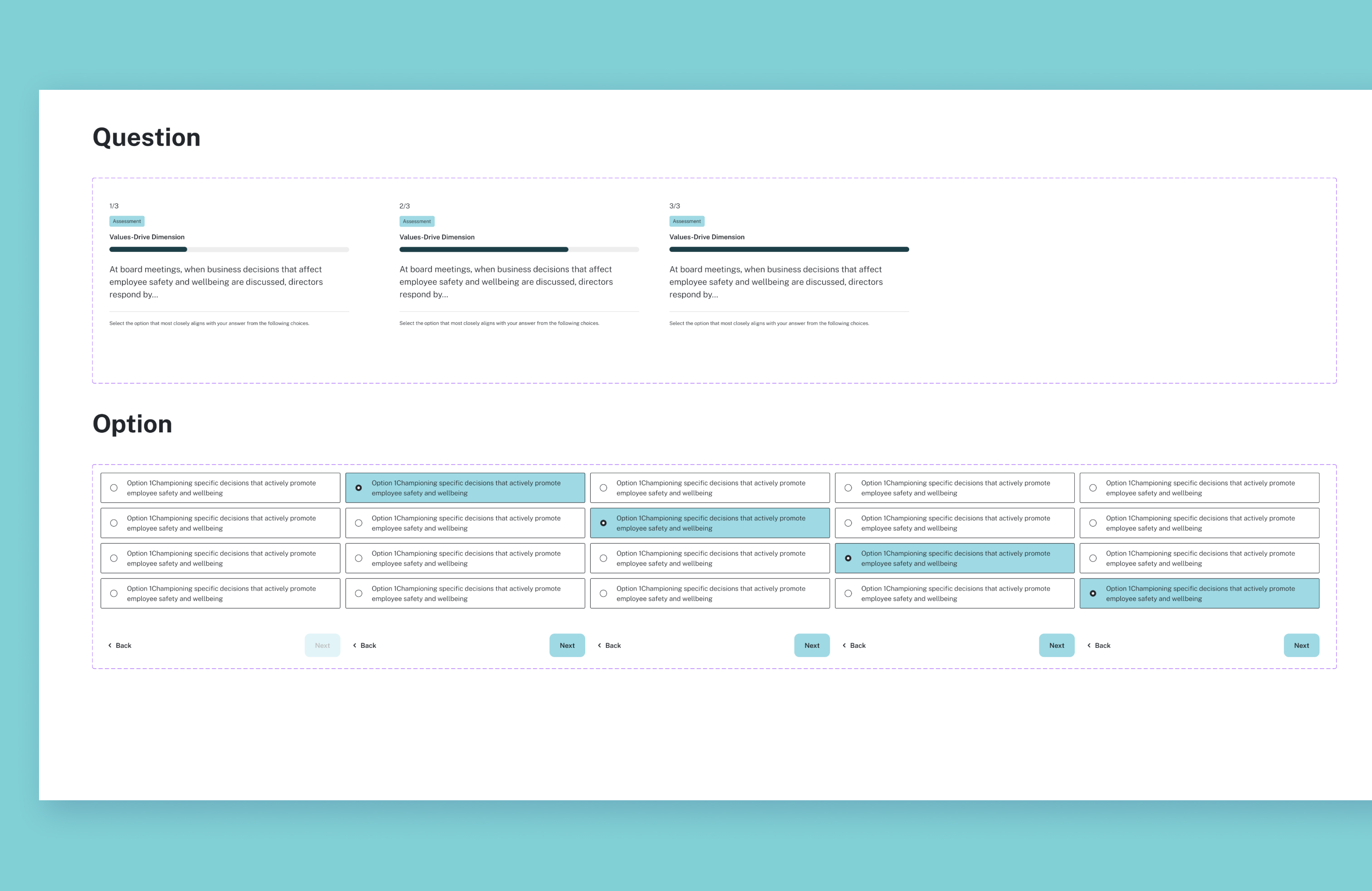
Analyse the documents and clarify the requirements for designing the user flow and solutions for the main requirements.
- Navigation for long process
- Supporting notification
- Screening question
- Landing page
- Data visualisation.
- Navigation for long process
- Supporting notification
- Screening question
- Landing page
- Data visualisation.
2. Rapid Prototyping for Feedback
I built the interactive prototypes to gather feedback and validate user flows from stakeholders. This helped me manage stakeholder expectations efficiently.
1. Modal – Tested how modals could support additional explanations and prevent user errors
2. Navigation Clarity – Ensured users felt guided through each step of the assessment
3. Reusable Components – Used a consistent component system to simplify both the prototype and future development handoff
Prototype Link
2. Navigation Clarity – Ensured users felt guided through each step of the assessment
3. Reusable Components – Used a consistent component system to simplify both the prototype and future development handoff
Prototype Link
Modal Flows
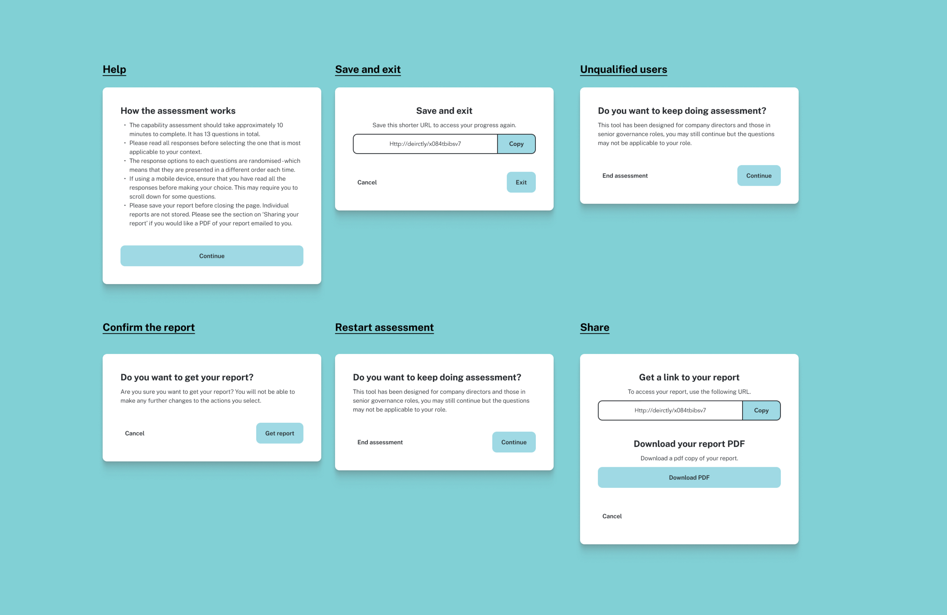
Navigation Clarity
Reusable Components
3. Support mobile devices
Mobile
4. Usability Improvements
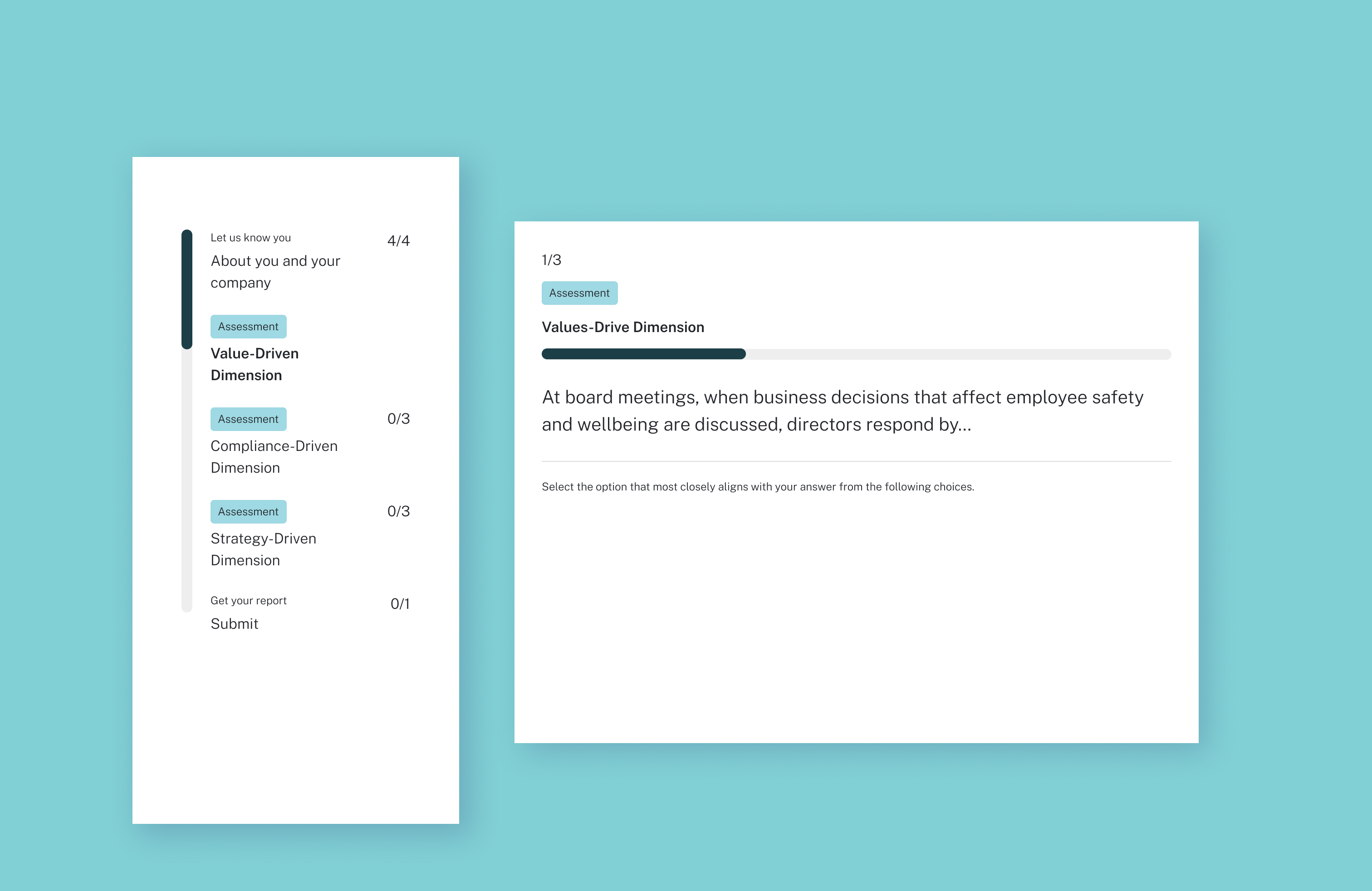
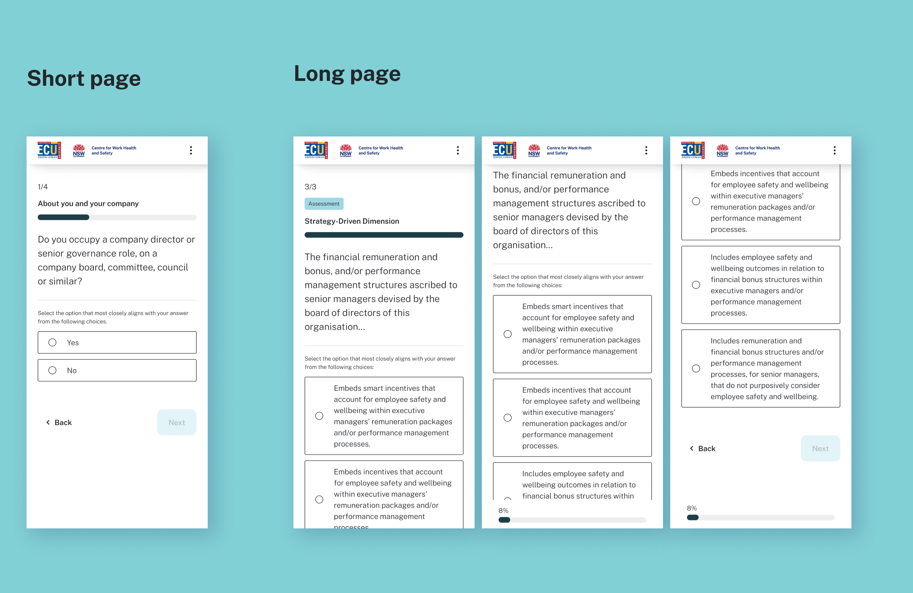
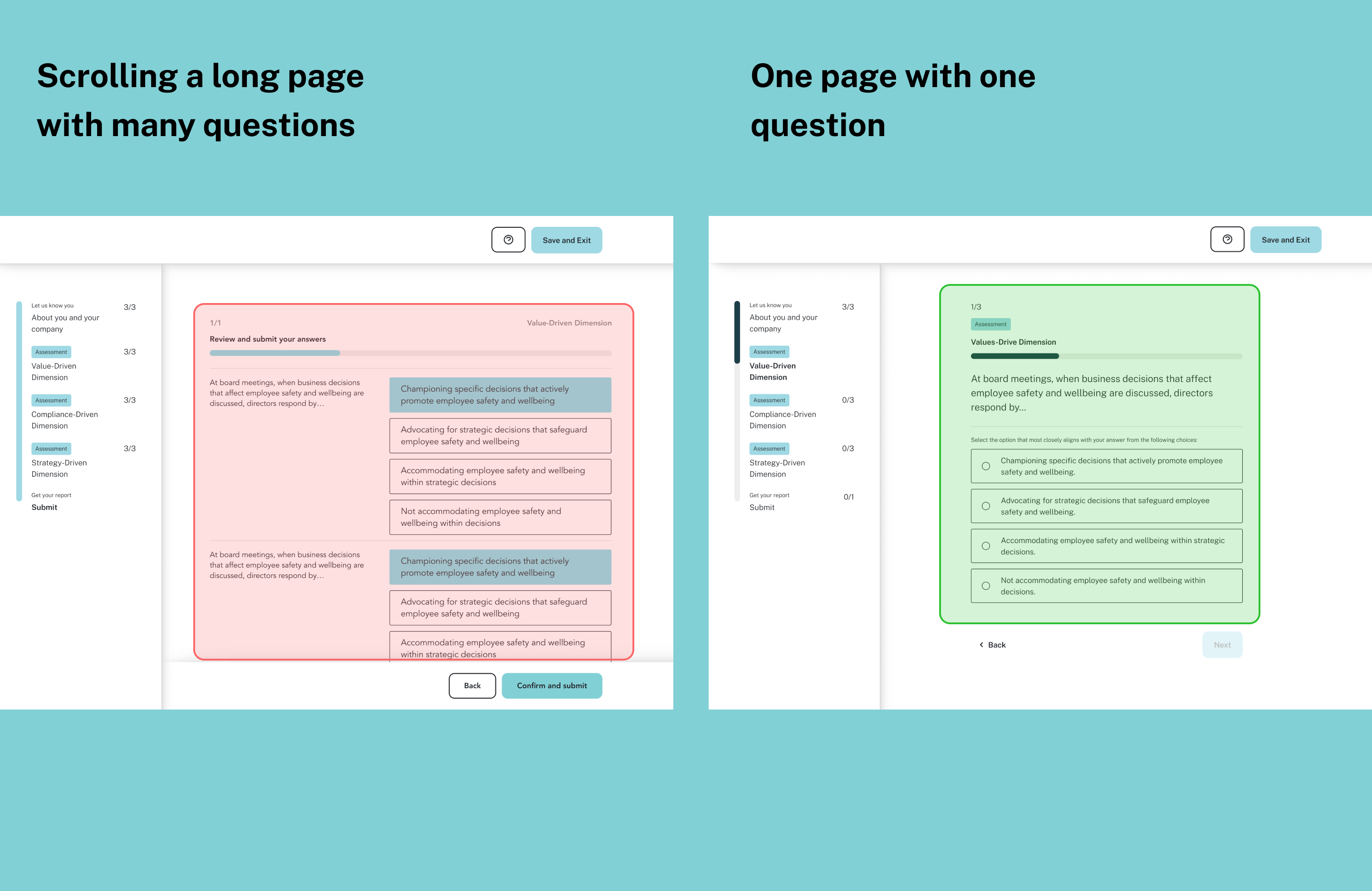
1. Progressive disclosure:
Shifted from a one-page survey to progressive disclosure for better focus. Also and adapt traditional radio to increase usability
2. Scannability:
Replaced dropdowns with visible option lists to improve scannability.
Shifted from a one-page survey to progressive disclosure for better focus. Also and adapt traditional radio to increase usability
2. Scannability:
Replaced dropdowns with visible option lists to improve scannability.
Progressive disclosure
Sscannability

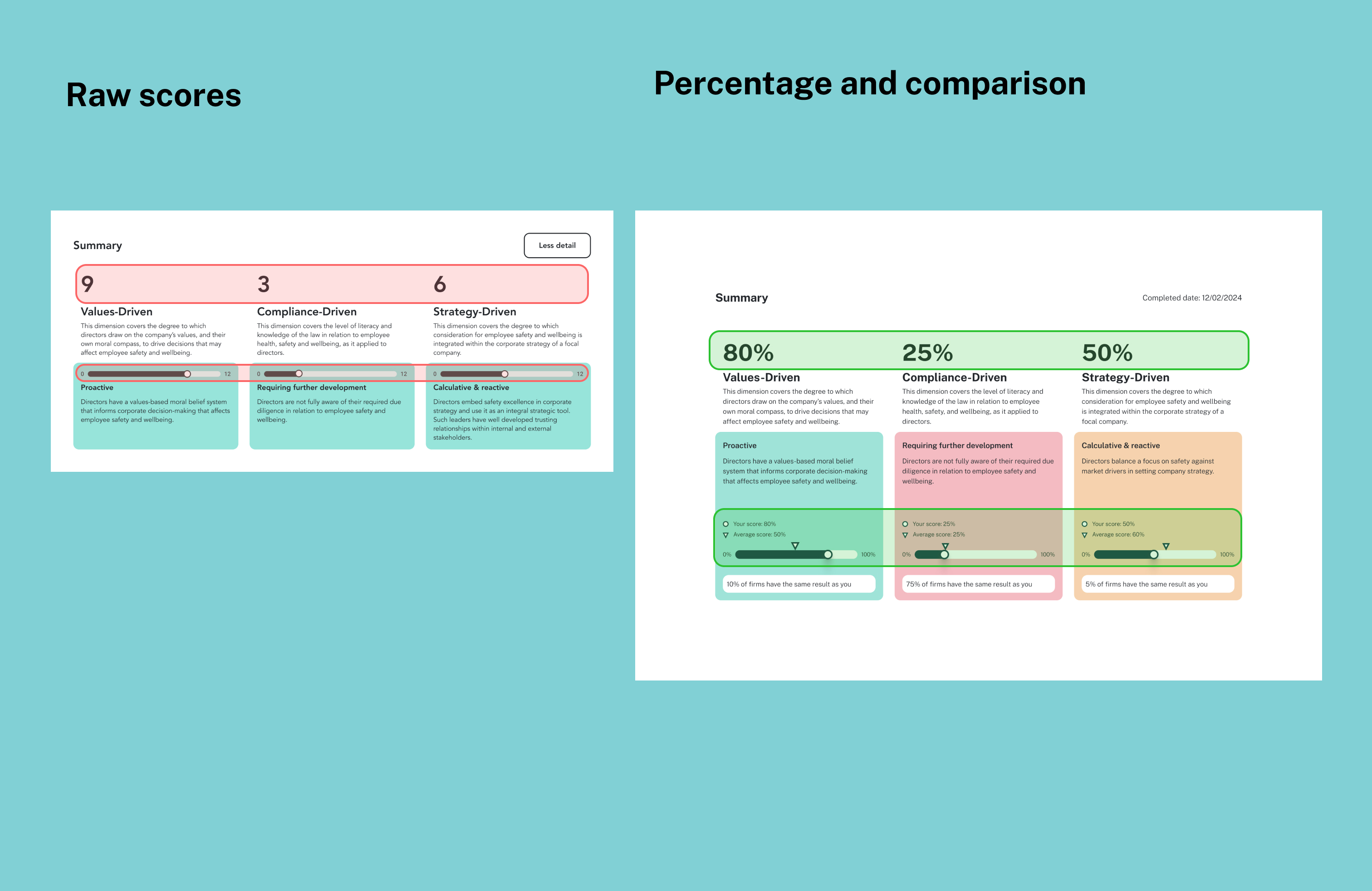
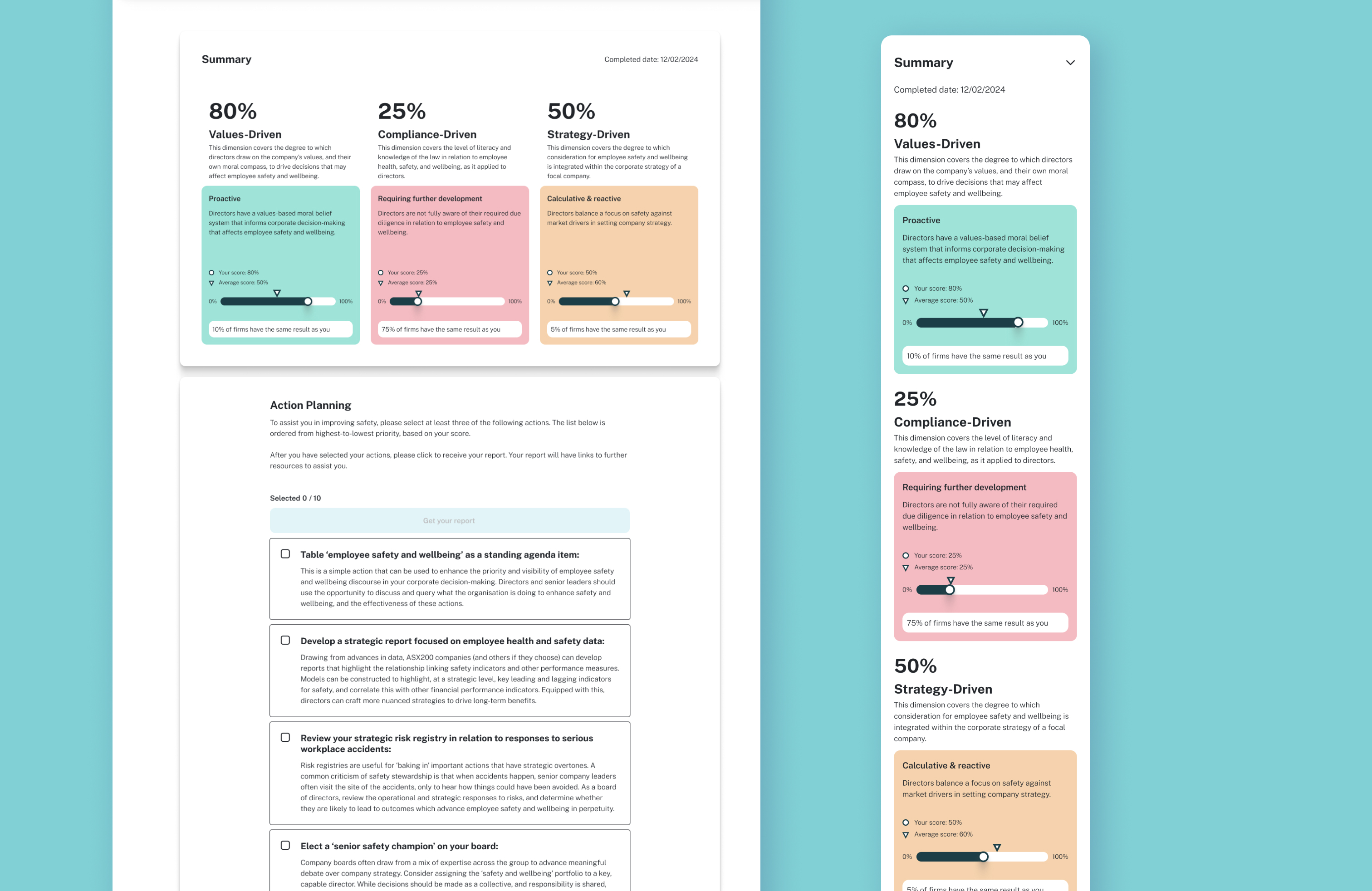
5. Positive Data Visualisation
1. Avoided showing raw scores to reduce judgement.
2. Used percentage-based benchmarks for comparison with peers or organisations.
3. Focused on strengths and opportunities instead of “good vs bad” scores.
2. Used percentage-based benchmarks for comparison with peers or organisations.
3. Focused on strengths and opportunities instead of “good vs bad” scores.
Positive Data Visualisation
Final design
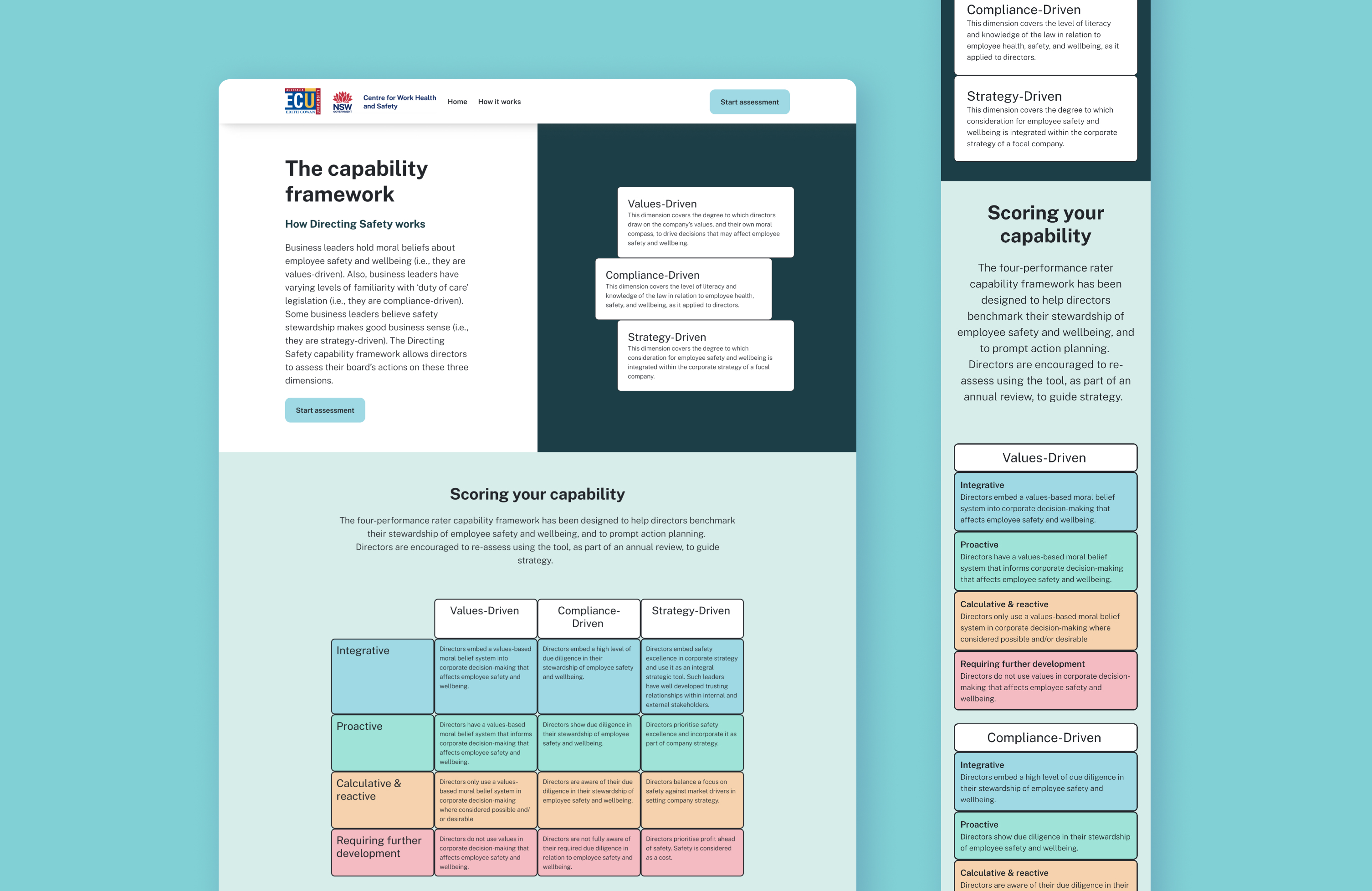
1. Landing Page
Introduced the capability framework and explained how the tool works.
Introduced the capability framework and explained how the tool works.
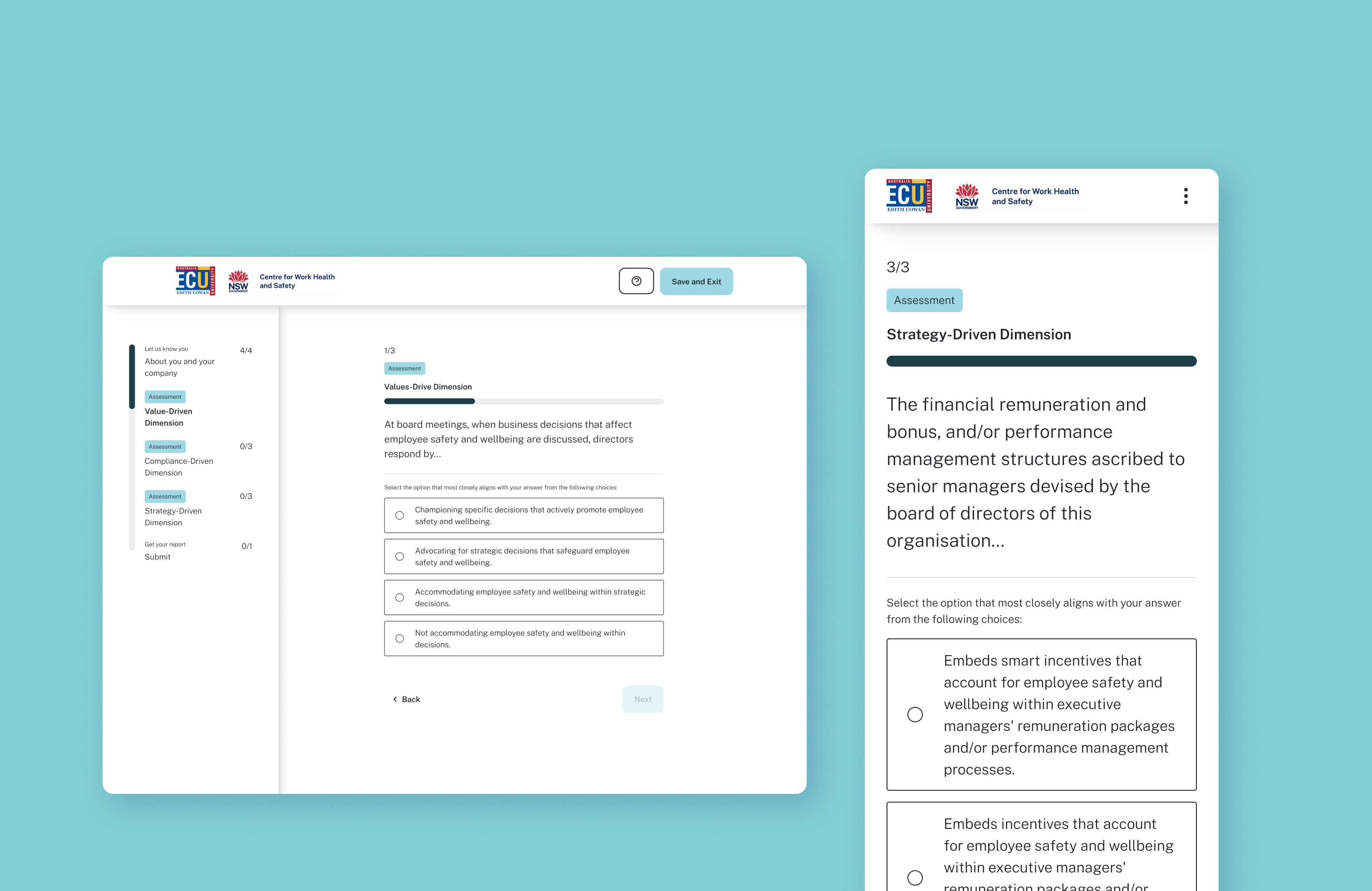
2. Main Assessment
Provided a simple, guided self-assessment experience with consistent visual cues and navigation patterns.
Provided a simple, guided self-assessment experience with consistent visual cues and navigation patterns.
3. Customised Reporting
Generated reports that highlighted user strengths and provided benchmarks for comparison—focusing on motivation and clarity over judgement.
Generated reports that highlighted user strengths and provided benchmarks for comparison—focusing on motivation and clarity over judgement.
Outcome
1
Achieve 100% survey completion rate in the UAT.
1. Select and unselect an option> 2. Go next> 3. Get help and exit > 4. Submit > 5. Check the result > 6. Customise report > 7. Get report

Learning
Two takeaways I have learned through this project when I counter design conflicts:
1. Uncover the real needs behind stakeholder feedback
2. Provide options to support better decision-making
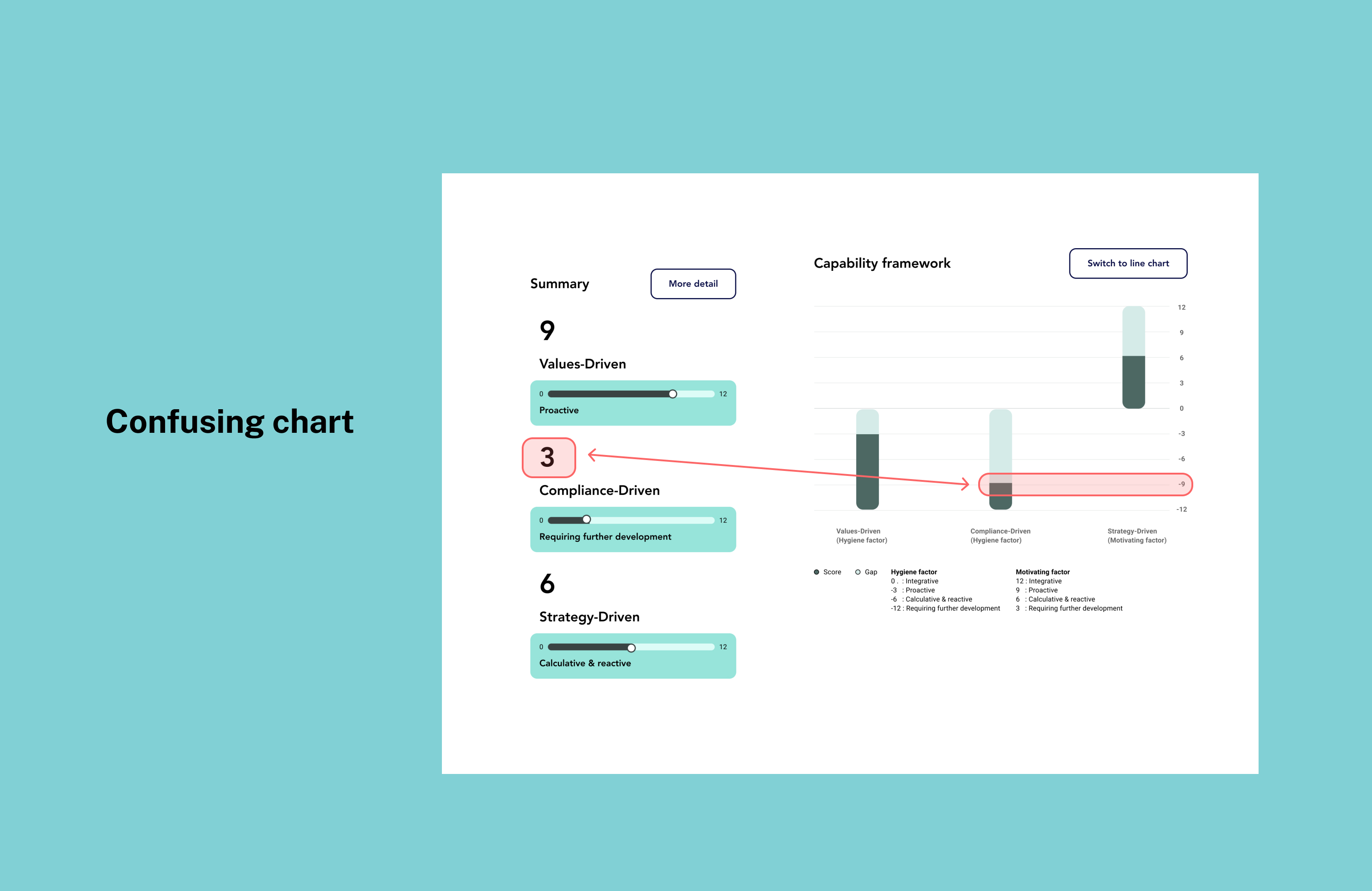
While designing the data visualisation, I was asked to highlight one of the three areas in the capability framework, which might result in a confusing chart for users. Through deeper conversations, I discovered that the client viewed two areas as a foundational capability (Value-driven and compliance-driven)—meaning most managers are expected to perform well in them than the last one (Strategy-driven). I prepared two solutions to show the potential problem visually. I also explained that using average score indicators is clear enough for comparison.
While designing the data visualisation, I was asked to highlight one of the three areas in the capability framework, which might result in a confusing chart for users. Through deeper conversations, I discovered that the client viewed two areas as a foundational capability (Value-driven and compliance-driven)—meaning most managers are expected to perform well in them than the last one (Strategy-driven). I prepared two solutions to show the potential problem visually. I also explained that using average score indicators is clear enough for comparison.
.jpg)
.jpg)