Palette - E Learning platform admin
Helps learning providers to market, manage and sell courses.
.jpg)
Intro
Role
Product designer
Duration
Mar - Dec 2020
Team
Skill
UX design
UI design
Information Architecture
Design System
Usability Test
End-to-End Product Design
1. Product
Palette (Renamed to Course-hub) is a service that helps learning providers market, manage, and sell courses. We helped clients set up their websites to sell courses, which included managing course content on their websites, payment solutions, enrollment management, and marketing campaigns.
2. User
Our clients are universities or training organisations that need a white-label website aligned with their brand to sell their courses and efficiently manage enrolment.
3. User Story
As an administrator, I want to access a certain enrolment from the admin and contact a specific student to deal with the payment issue.
Summary
As a solo product designer, I spent two months redesigning and shaping the new direction of the admin experience. I collaborated closely with product managers and engineers to define strategy, simplify complex workflows, and build a scalable design system from scratch. As a result, the redesigned platform contributed to a 50% growth in subscription clients over 10 months.
Problem
Lack of direct view for enrolment data related to each intake:
Users want to access intake performance and student profiles directly within the platform to streamline their workflow.
Users want to access intake performance and student profiles directly within the platform to streamline their workflow.
.jpg)
Unclear Interface Structure:
1. The top navigation is unclear, and it is not easy to fit complex features in the future.
2. All the fields are listed on a single page
2. All the fields are listed on a single page
.jpg)
📌 Challenge:
How might we streamline the enrolment checking experience to improve efficiency?
Goal
Enhance the user experience for admins to efficiently complete their frequent tasks.
1
Reduce Task Time for Finding Enrolments
Implement an improved information structure and intuitive view pages to save users time.
2
Reduce Product Education Time
Introduce user-friendly patterns to guide users and minimise confusion within the system.
3
Reduce Implementation Time for Feature Expansion
Leverage a design system to help developers streamline implementation and save time.
4
Increase Product-Market Fit
Address the needs of small organisations to avoid a narrow product perspective and broaden market appeal.
Design process
1. User research
.jpg)
2. Considering business opportunities
We saw an opportunity to position the platform as more than a course management tool, but also an analytics solution. By extracting marketing insights from sales data that support marketing and campaign decisions, we could help clients scale their course sales effectively.
📌 Opportunities:
Extracting valuable marketing insights from sales data could meet clients' expectations.
Extracting valuable marketing insights from sales data could meet clients' expectations.
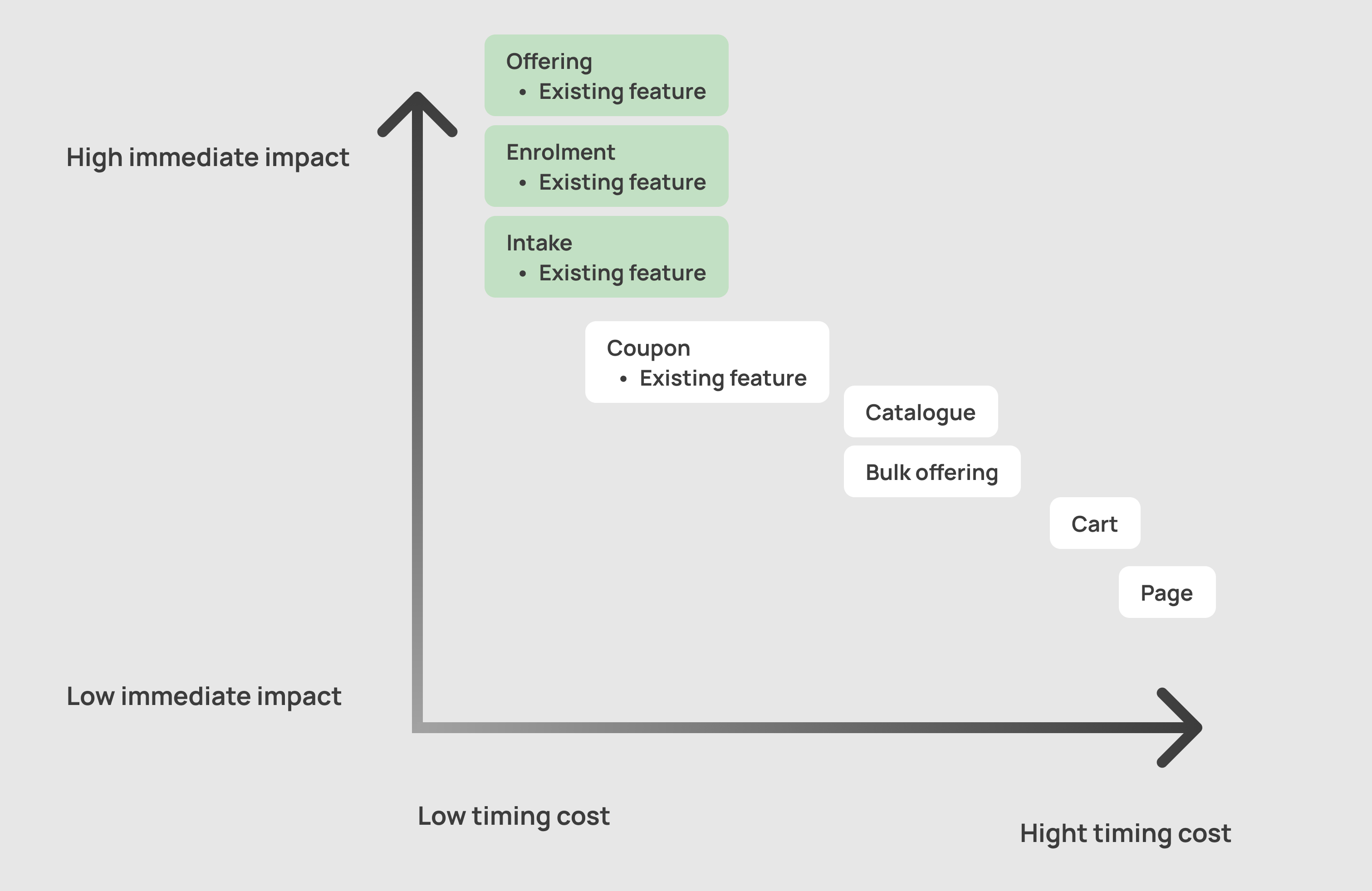
3. Prioritising Features Collaboratively
Working closely with the product managers and engineers, we prioritise features for a lean first release. We focused on existing feature optimisations and considered the potential expansion ability.
This approach ensured we could move fast while setting a foundation for continuous improvement.
This approach ensured we could move fast while setting a foundation for continuous improvement.
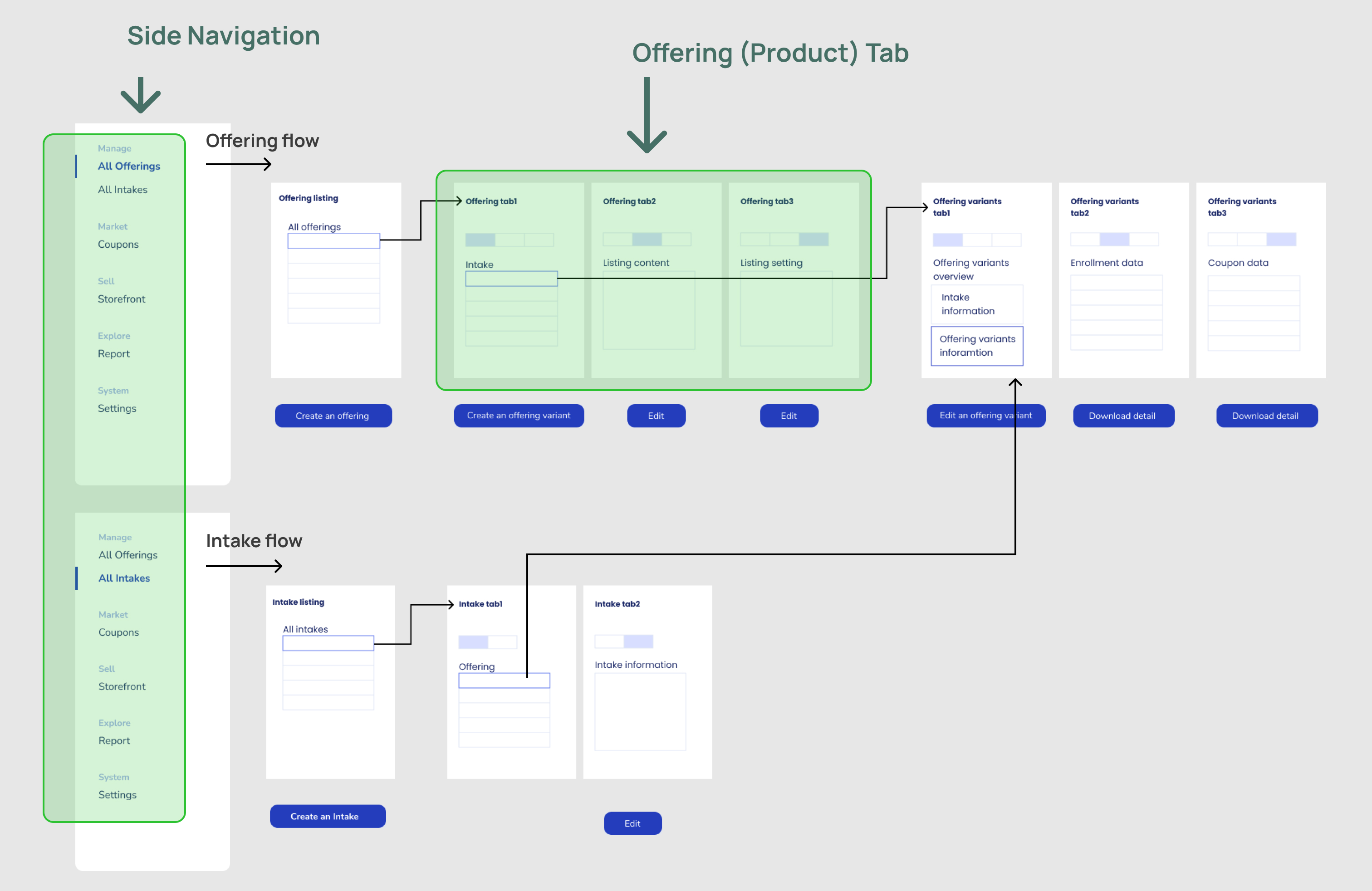
4. Restructuring the Information Architecture
Through brainstorming for features categorisation, resulting in two areas for users to navigate in the platform
Side Navigation:
Grouped into four top-level categories: Manage, Market, Sell, and Explore—helping users quickly connect their tasks to platform capabilities.
Offering (Product) Tab:
Reorganised content into three clear tabs, each addressing a different aspect of course setup. This allowed users to grasp and access what they need faster, without overwhelming them.
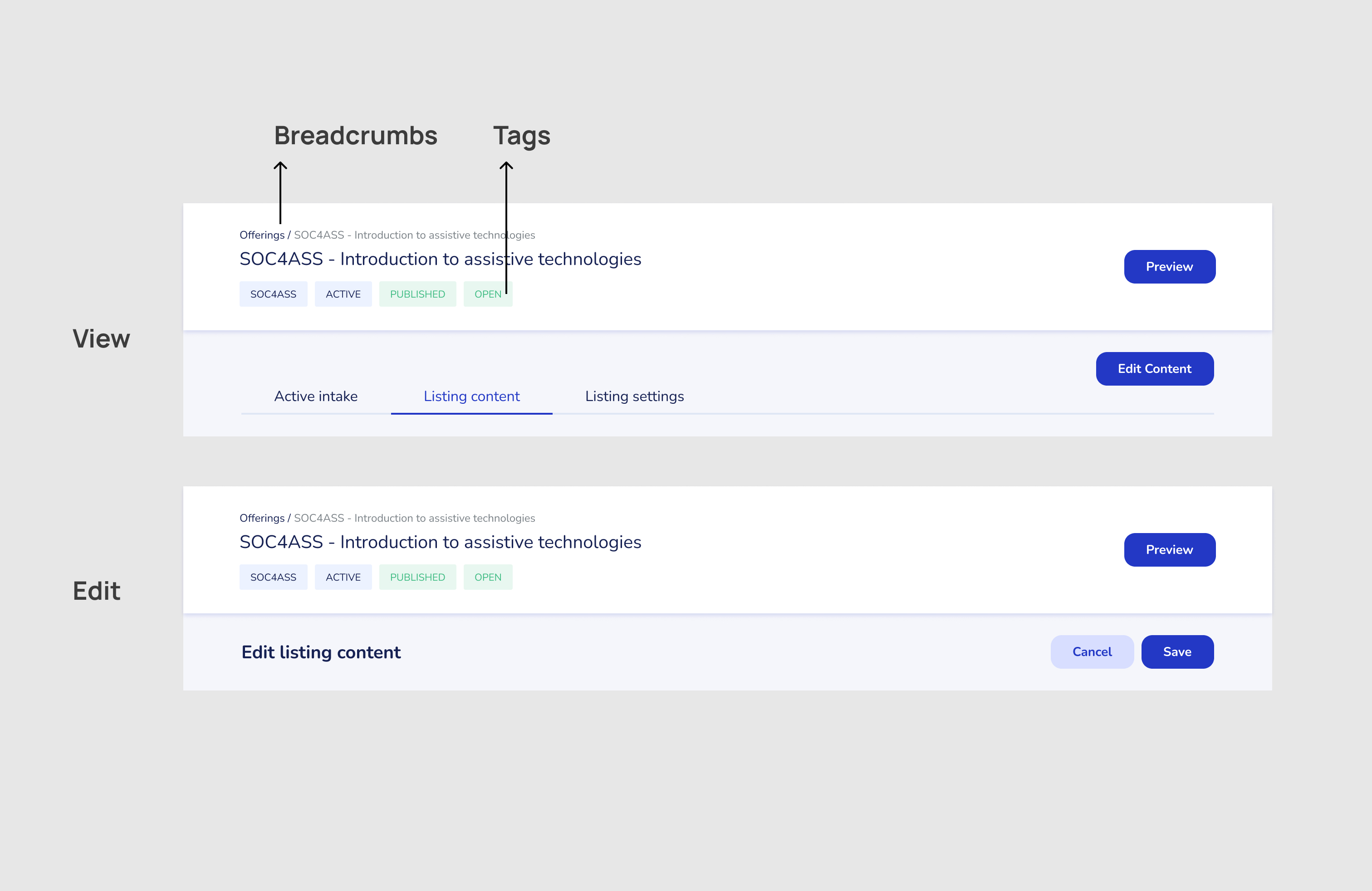
5. Designing Learnable Patterns
To reduce confusion between different tasks, I implemented a clean separation of modes:
“View” vs. “Edit” Modes:
Users can clearly distinguish between reading information and editing content.
Breadcrumbs and Tags:
Designing indicators helps users stay informed and scan the information in the header
“View” vs. “Edit” Modes:
Users can clearly distinguish between reading information and editing content.
Breadcrumbs and Tags:
Designing indicators helps users stay informed and scan the information in the header
Final solution
1
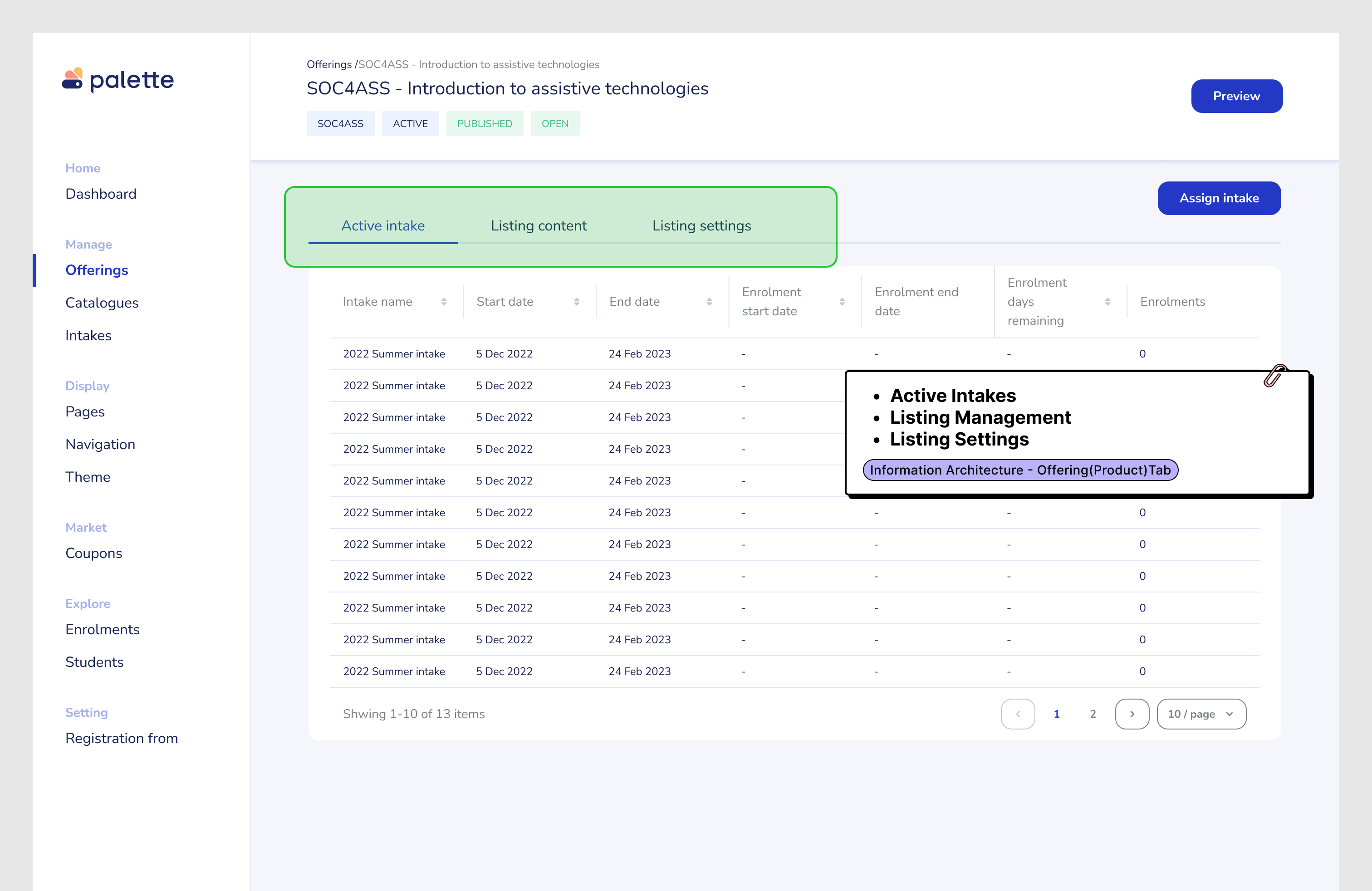
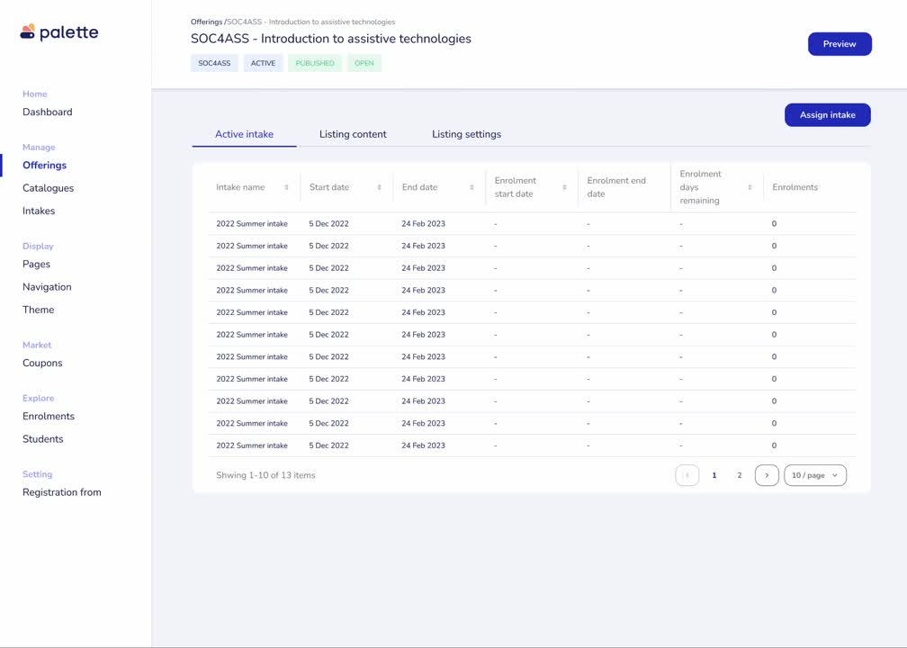
Information Architecture - Offering(Product)Tab
Grouped similar fields into three tabs—Active Intakes, Listing Management, and Listing Settings. This structure allows users to quickly access relevant content.
2
Information Architecture - Enrolment Data
Designed an enrolment data page, where users can view enrolment and revenue details without downloading CSV files.
.jpg)
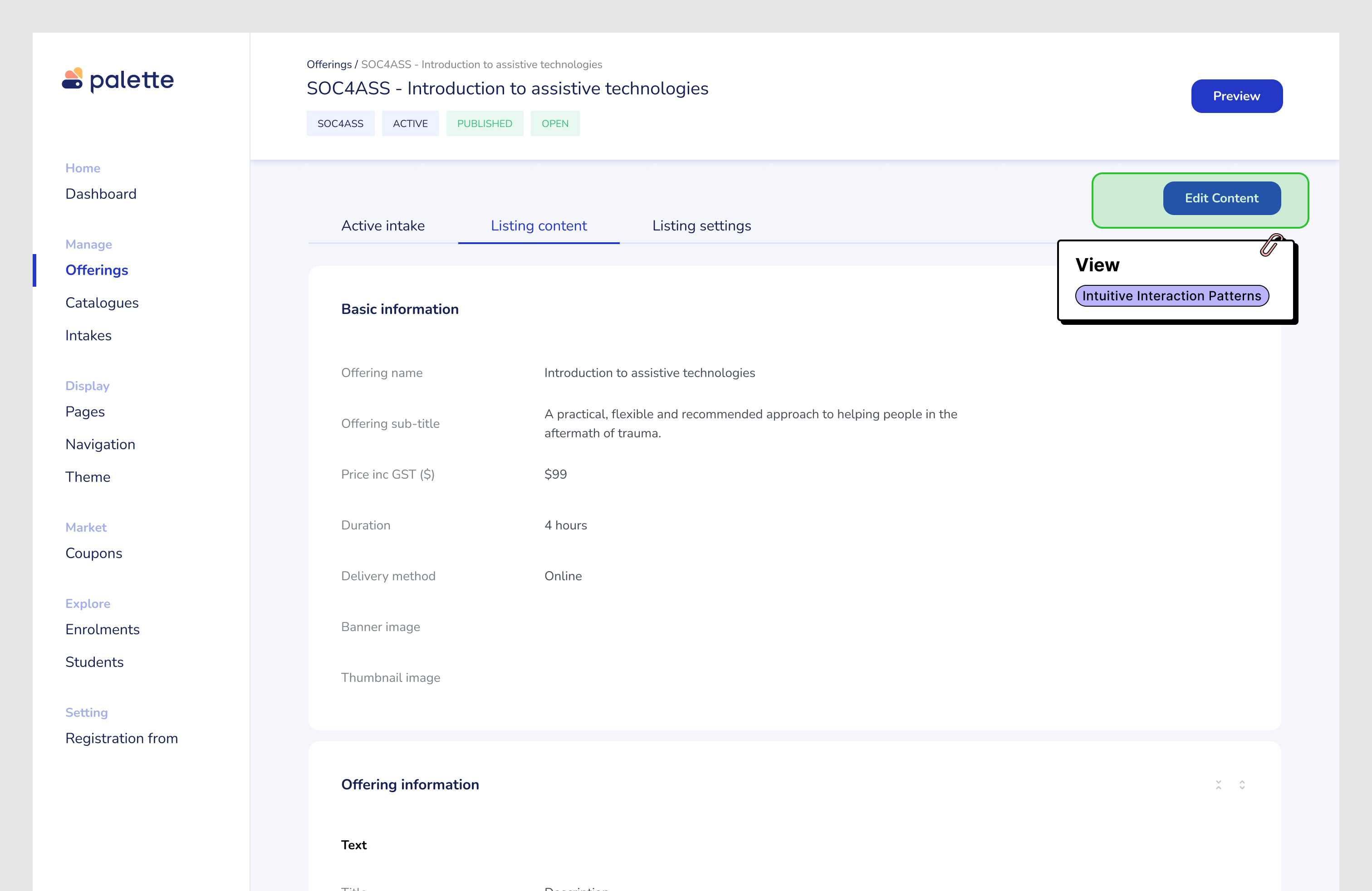
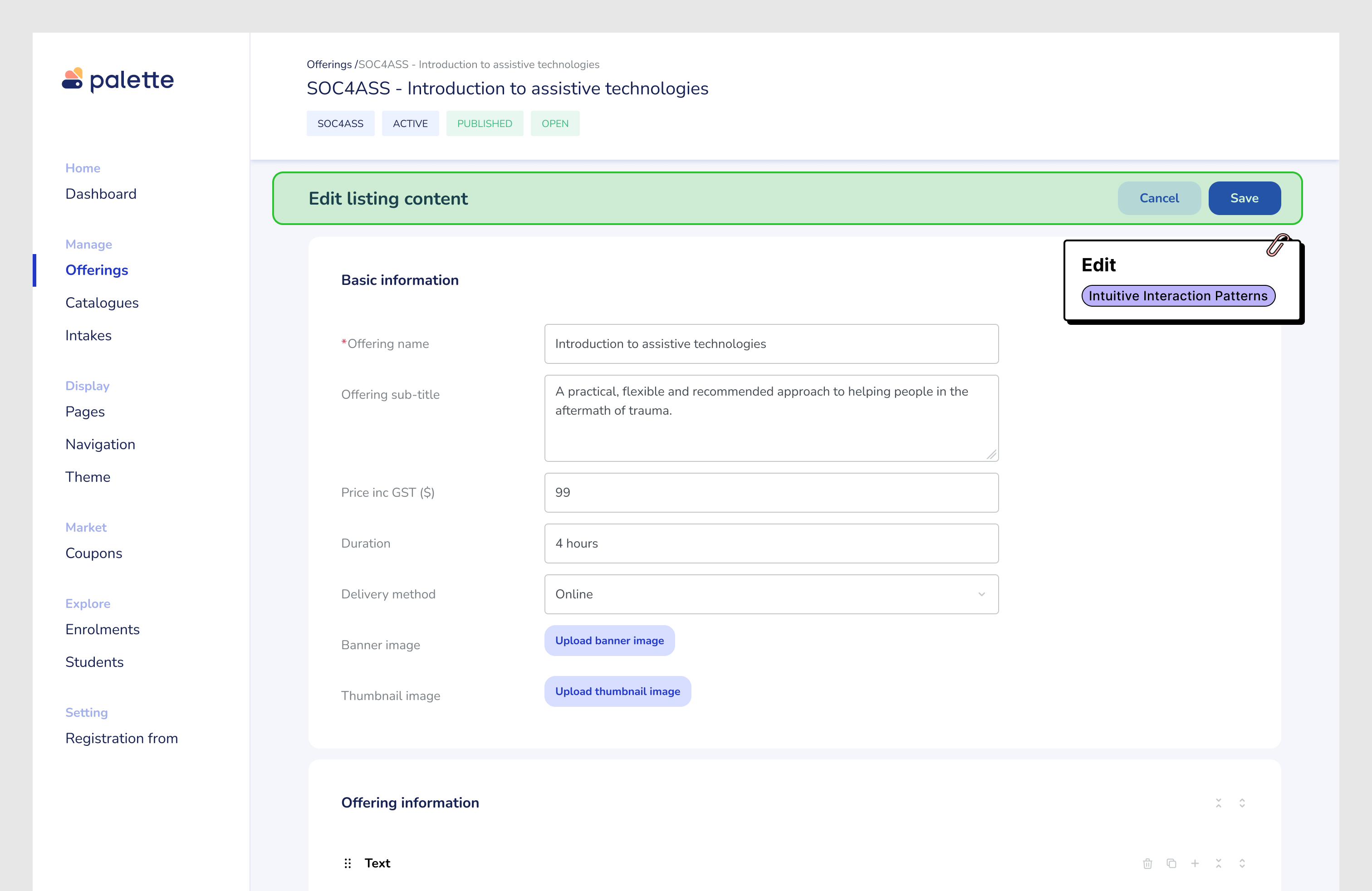
2
Intuitive Interaction Patterns
Pattern 1: Side navigation could easy expand in the future.
Pattern 2: A clear “View” and “Edit” pattern design, avoiding confusion
Pattern 2: A clear “View” and “Edit” pattern design, avoiding confusion
3
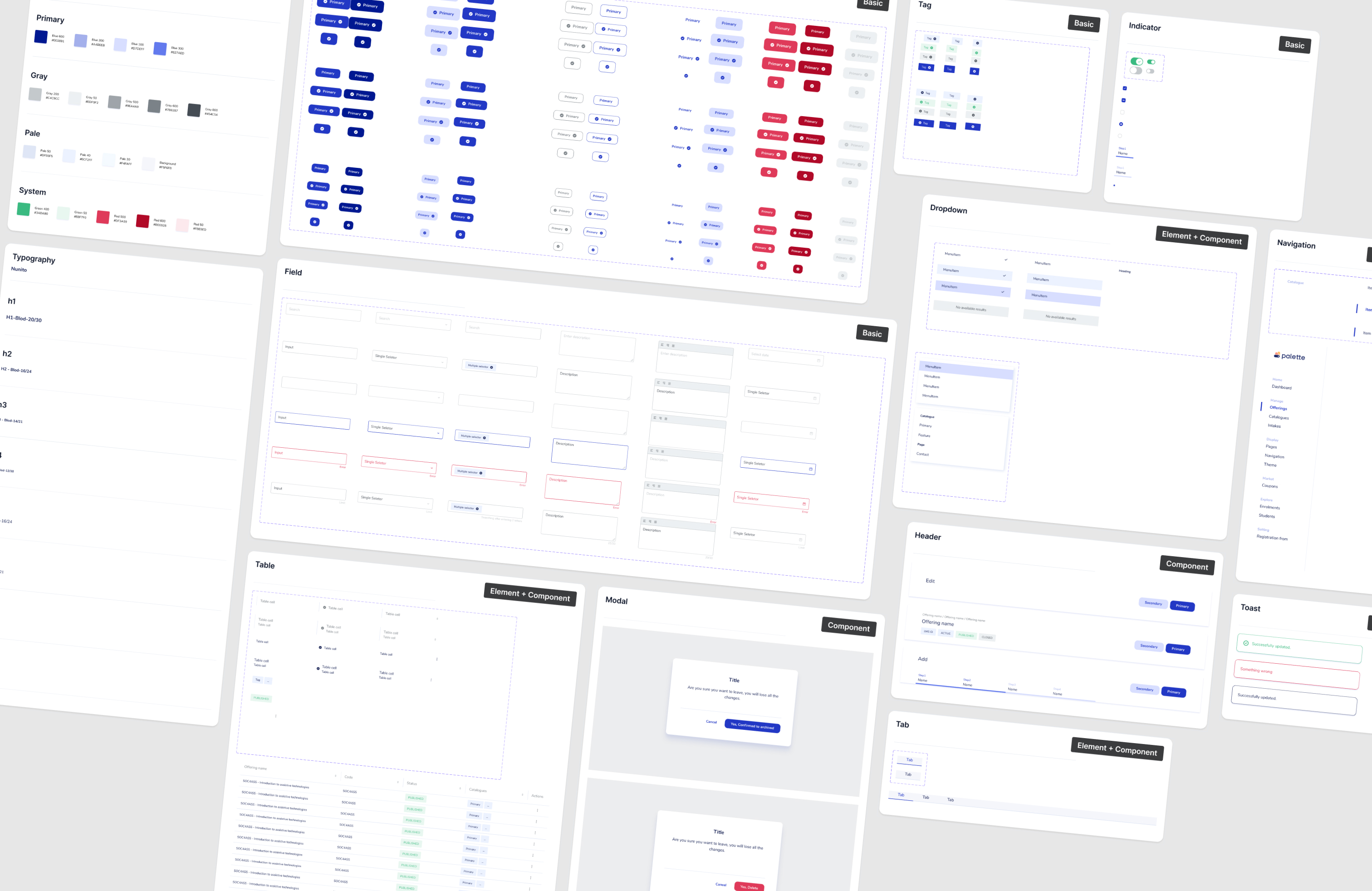
Scalable Design System
All pages supporting the components maintain visual consistency, accelerate development.
4
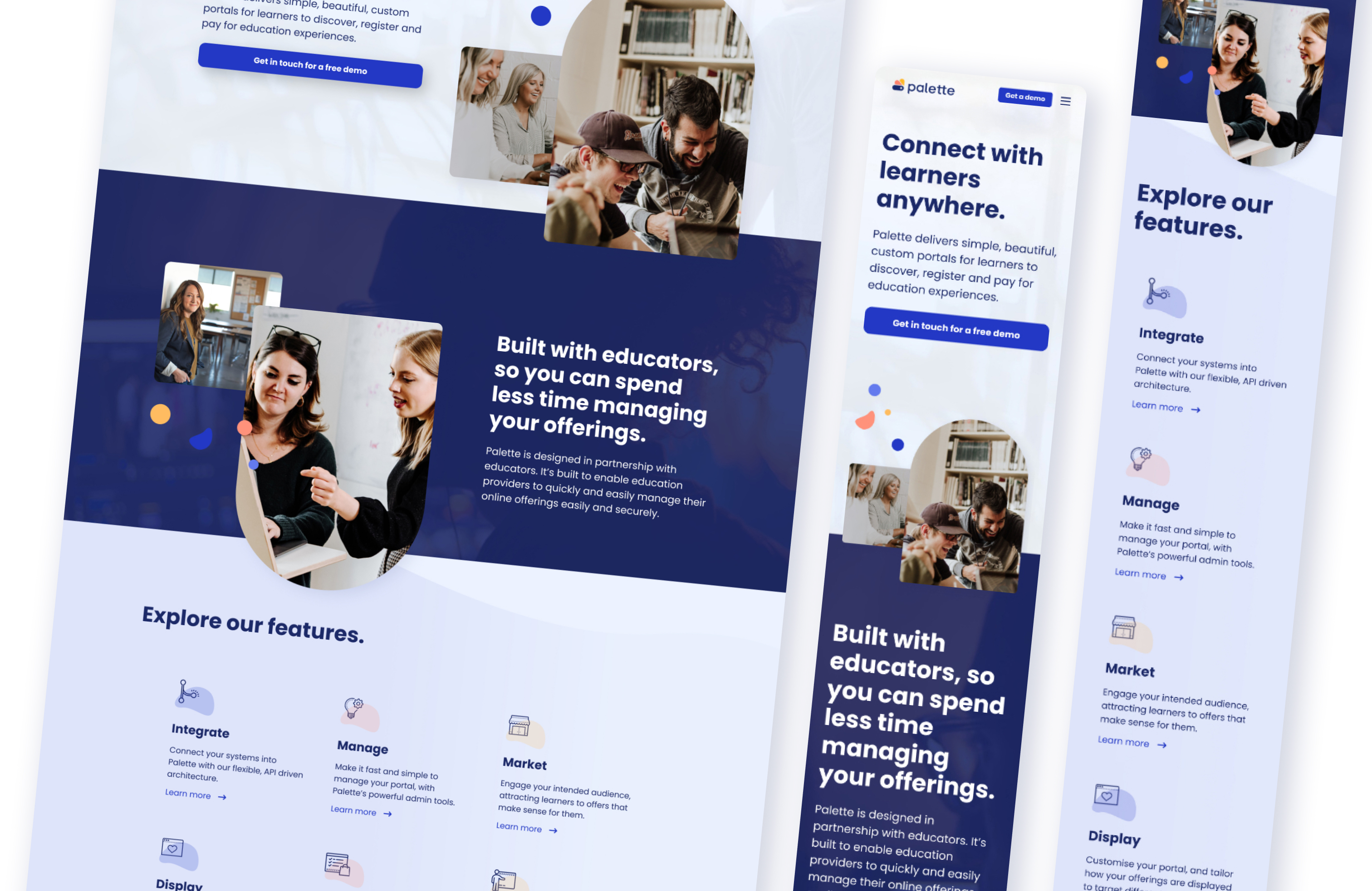
Marketing website
Collaborated with the product managers and marketing supporters to redesign the product identity and website, communicating our product vision and features to increase the client's growth.
Outcome
1
100% Positive Feedback from UAT Testing
Before launching the new version, we conducted user acceptance testing (UAT) with all existing clients. The redesigned enrolment view received 100% positive feedback, confirming it solved key usability issues around accessing enrolment data.
2
Reduced Product Education Effort
By defining clear personas, product flows, and use cases, we transformed what began as a bespoke client project into a scalable product. As a result, we reduced the need for onboarding meetings—allowing us to communicate features through blogs and a public roadmap.
3
Faster Implementation for New Features
I established modular design patterns and reusable flows that now serve as a foundation for future development. This significantly reduced design and development time for expanding features.
4
50% Growth in Customer Adoption (10 Months)
With the launch of a new marketing website and clearer product positioning, Palette saw a 50% increase in customer growth within 10 months. The improved brand presentation and feature clarity resonated with both new and existing clients.
1. Select an intake > 2. View enrolment data and overview > 3.Back to course > 4. View and edit the listing content > 5. View and edit the listing setting
.jpg)
.jpg)